not a soap
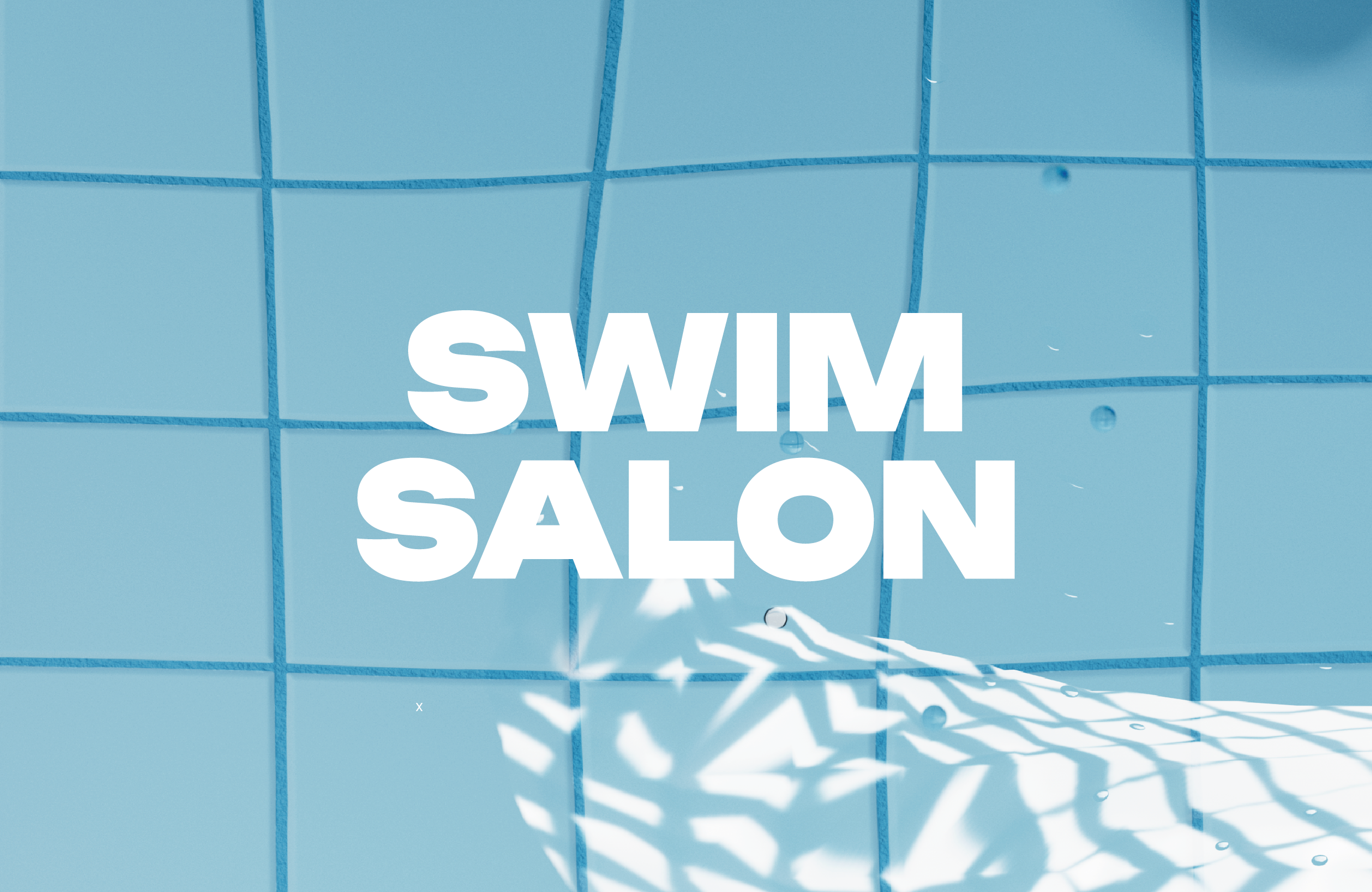
swim salon
broad beer
red nutrition
b the moment
broad beer
pet care
what a relief
fiora flower
fullday at noon
skinny routine
reikou incense
be steady
reikou candle
bread by mmow
j.betters
everie
i’m o
skinbalance
weekenders
sejong local food
whale company
simply food
good day good tea
protein powder
dip_bookshop
get sporty
plans & pricing
contect
home
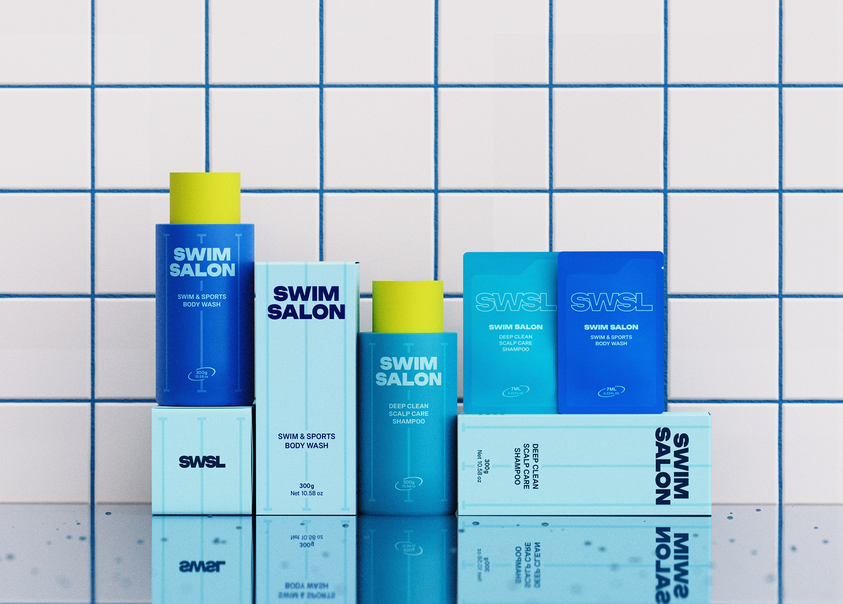
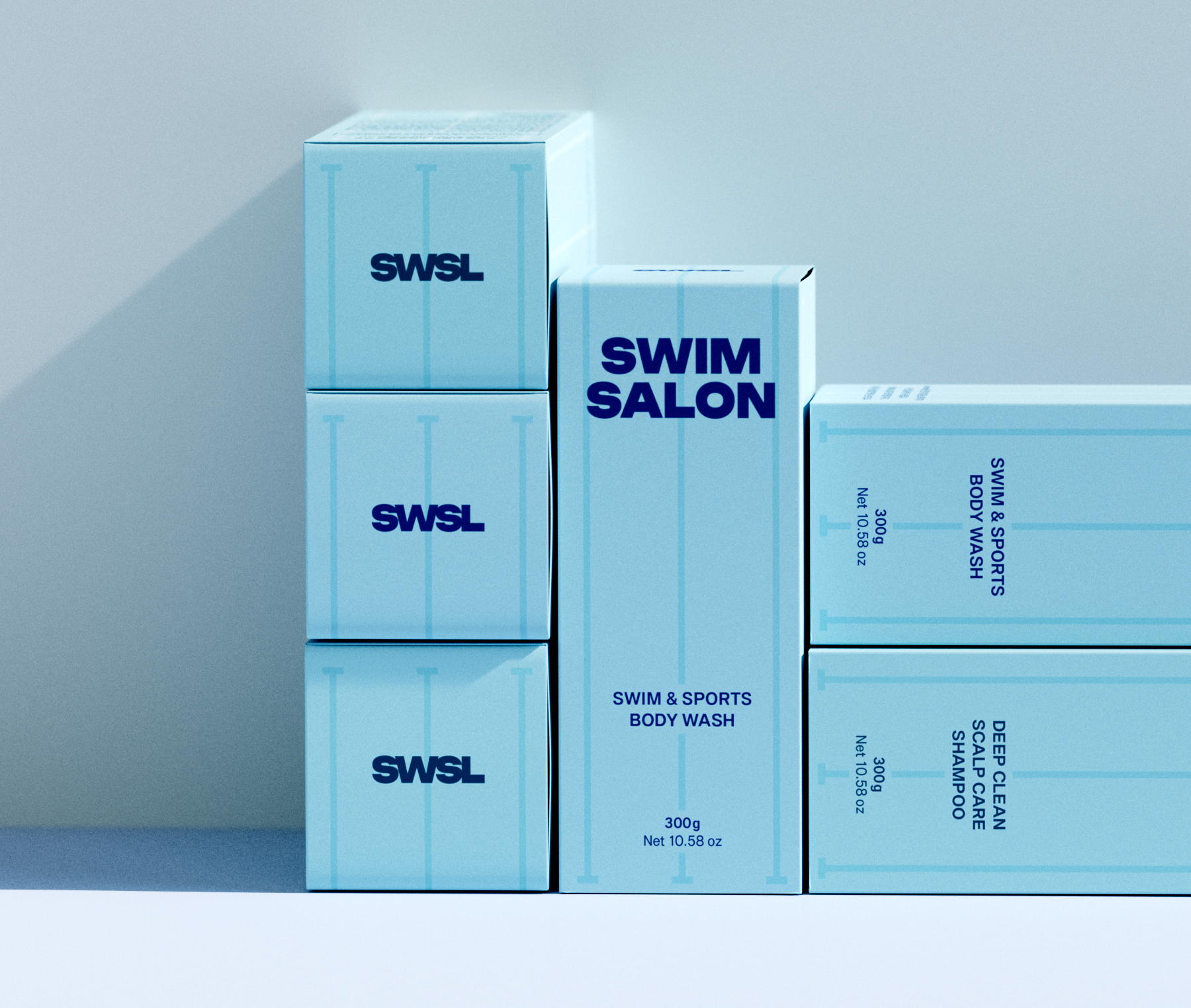
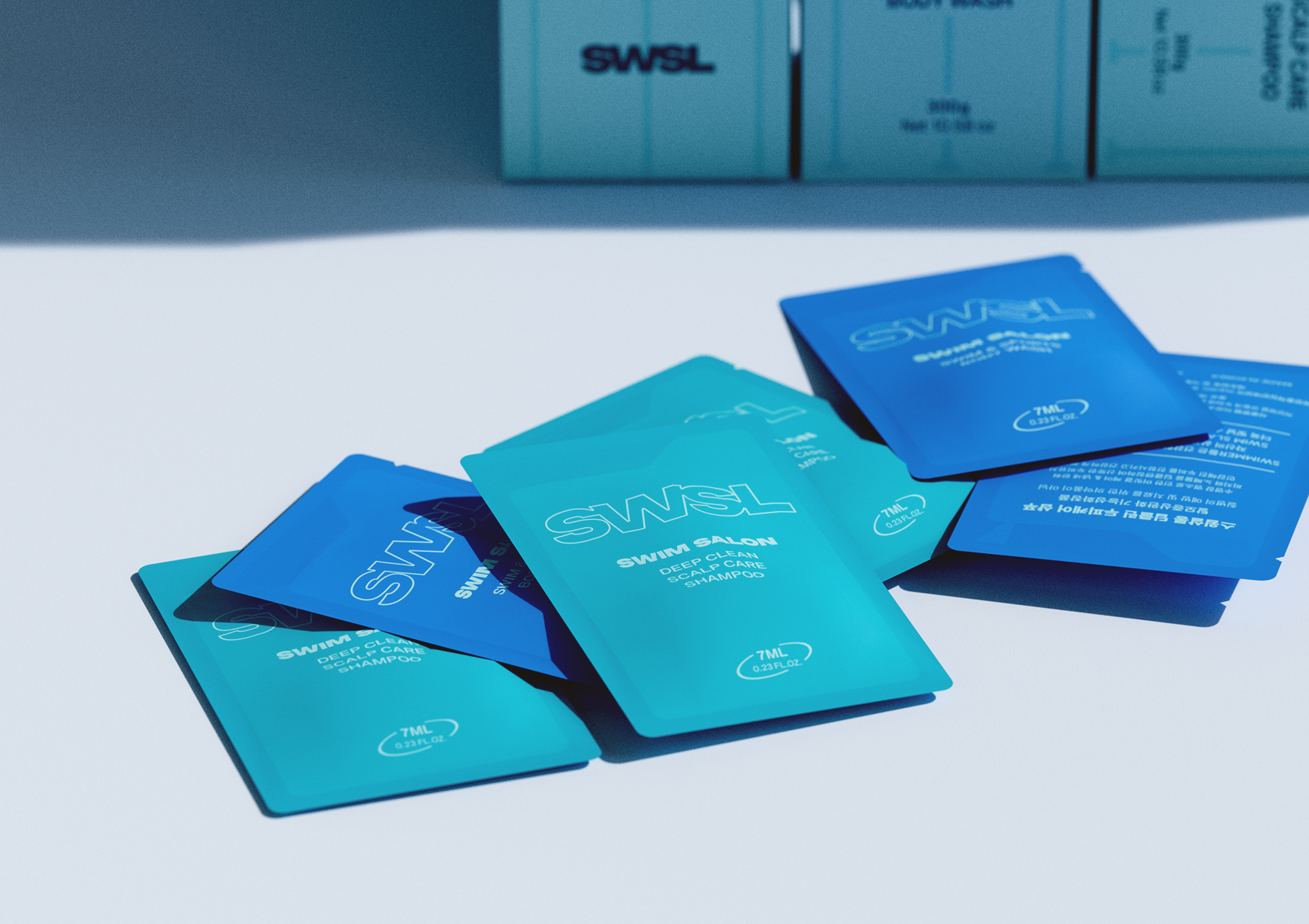
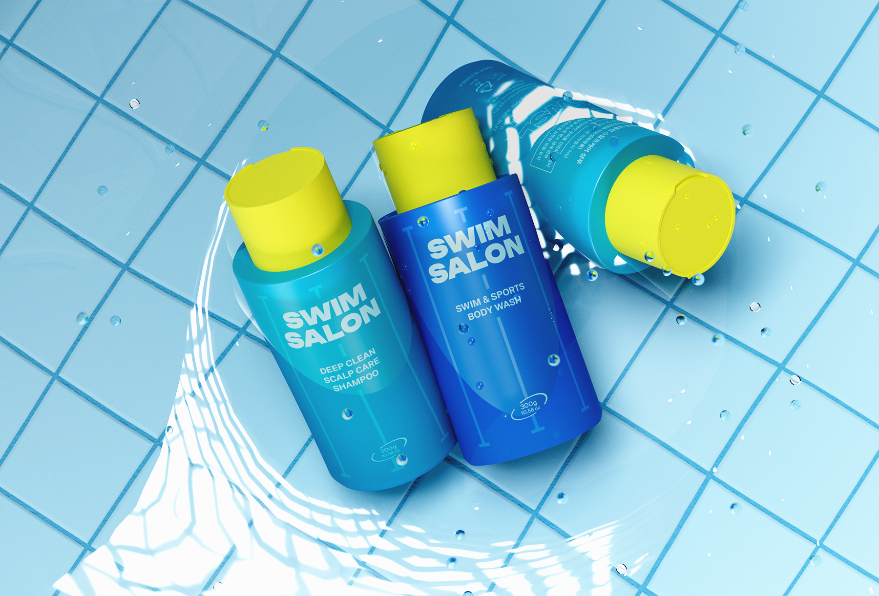
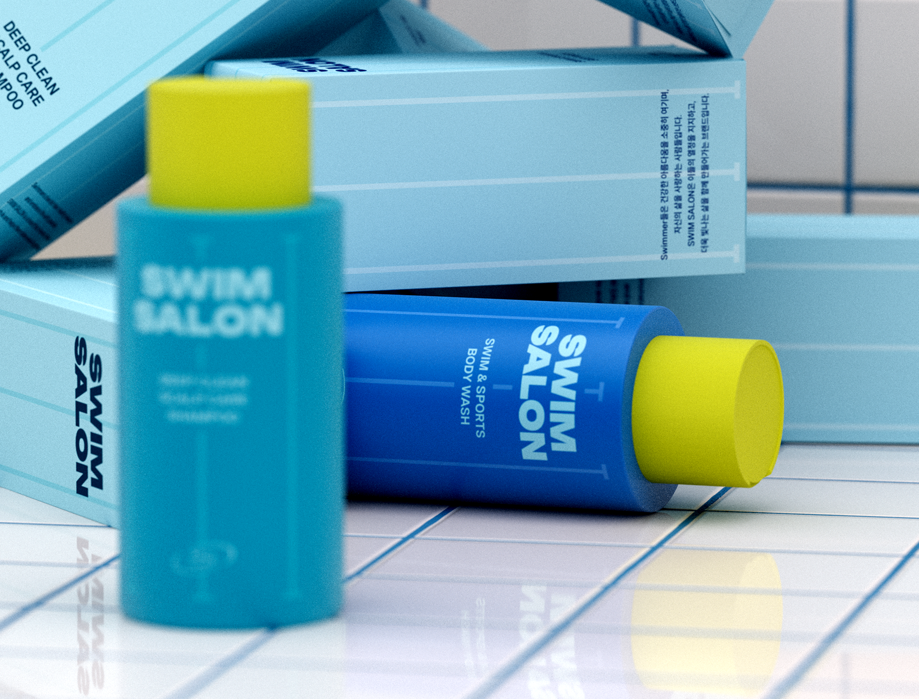
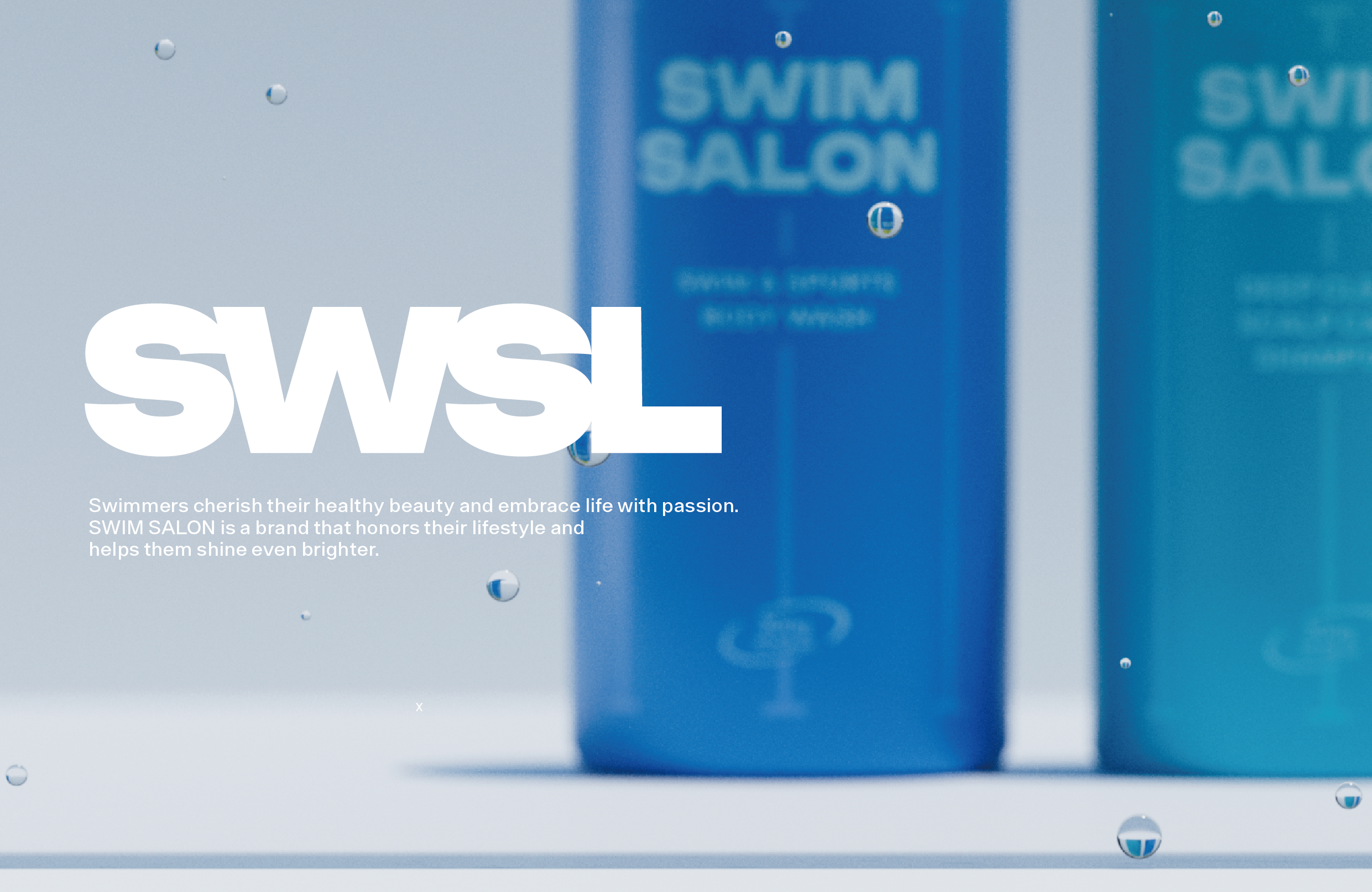
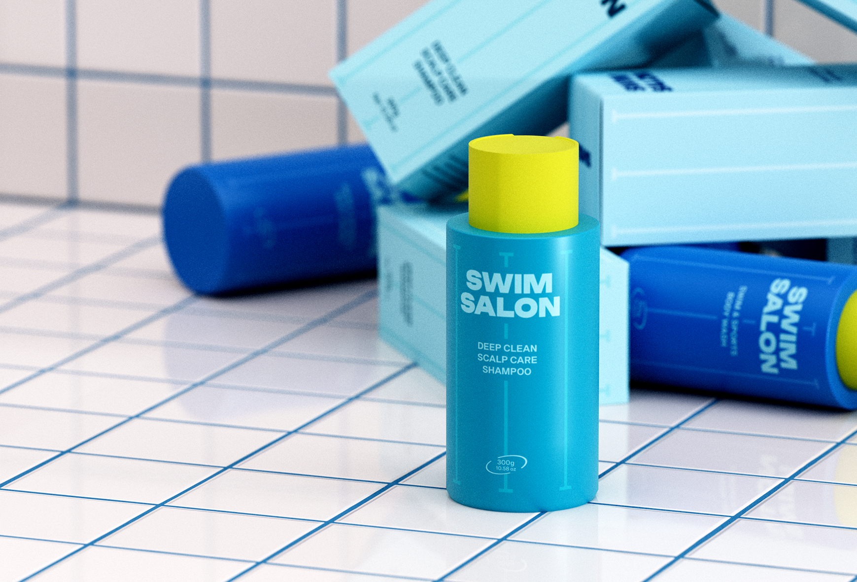
swim salon logo, packaging design
design direction
스윔살롱은 아침 수영을 일상의 루틴으로 삼는, 활기찬 20–30대 여성을 위한 퍼스널 케어 브랜드입니다. 실내 수영장의 생기 있는 무드에서 출발한 이 브랜드는 볼드한 로고와 대비적인 컬러, 미니멀한 그래픽으로 에너제틱한 브랜드 톤을 구축합니다.
'살롱'이라는 단어가 지닌 올드한 인상을 절제된 시각 구조로 재해석하며, 제품 하나만으로도 사용자의 라이프스타일을 감각적으로 전환시키는 힘을 담았습니다.
브랜드 기획 초기부터 디자인 전반을 디렉팅했으며, 디자인이 실질적인 시장 반응으로 이어져 트리트먼트 라인 확장까지 연결된 사례입니다.
Swim Salon is a personal care brand inspired by the energizing routine of early-morning swimmers. Its bold logo, contrasting colors, and minimal graphics reflect the vivid atmosphere of indoor pools.
The term “salon” is reimagined with a modern twist, creating a product that adds rhythm and freshness to daily life.
I directed the brand’s visual identity and packaging from the ground up, helping it gain traction and expand into a treatment line.