not a soap
swim salon
broad beer
red nutrition
b the moment
broad beer
pet care
what a relief
fiora flower
fullday at noon
skinny routine
reikou incense
be steady
reikou candle
bread by mmow
j.betters
everie
i’m o
skinbalance
weekenders
sejong local food
whale company
simply food
good day good tea
protein powder
dip_bookshop
get sporty
plans & pricing
contect
home
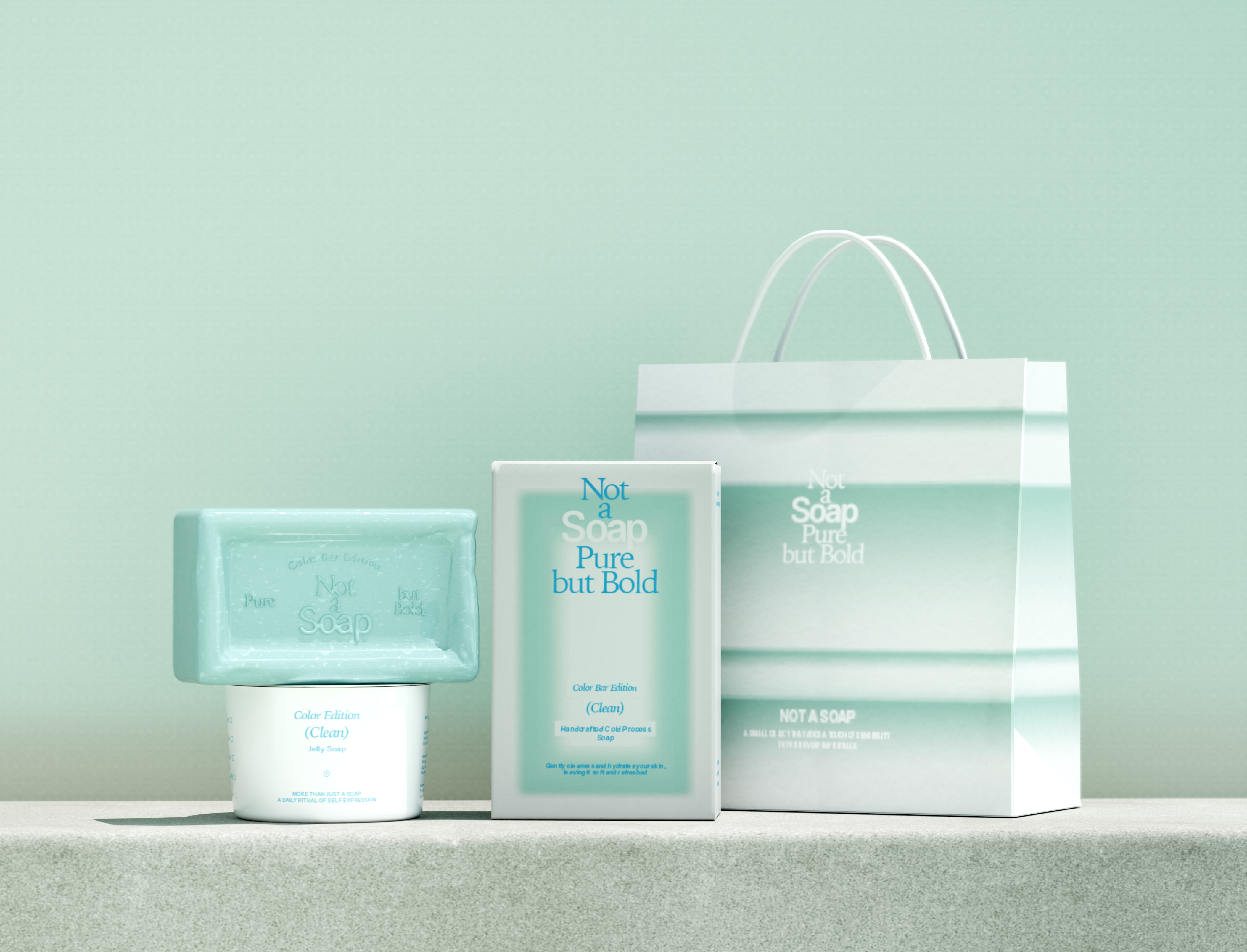
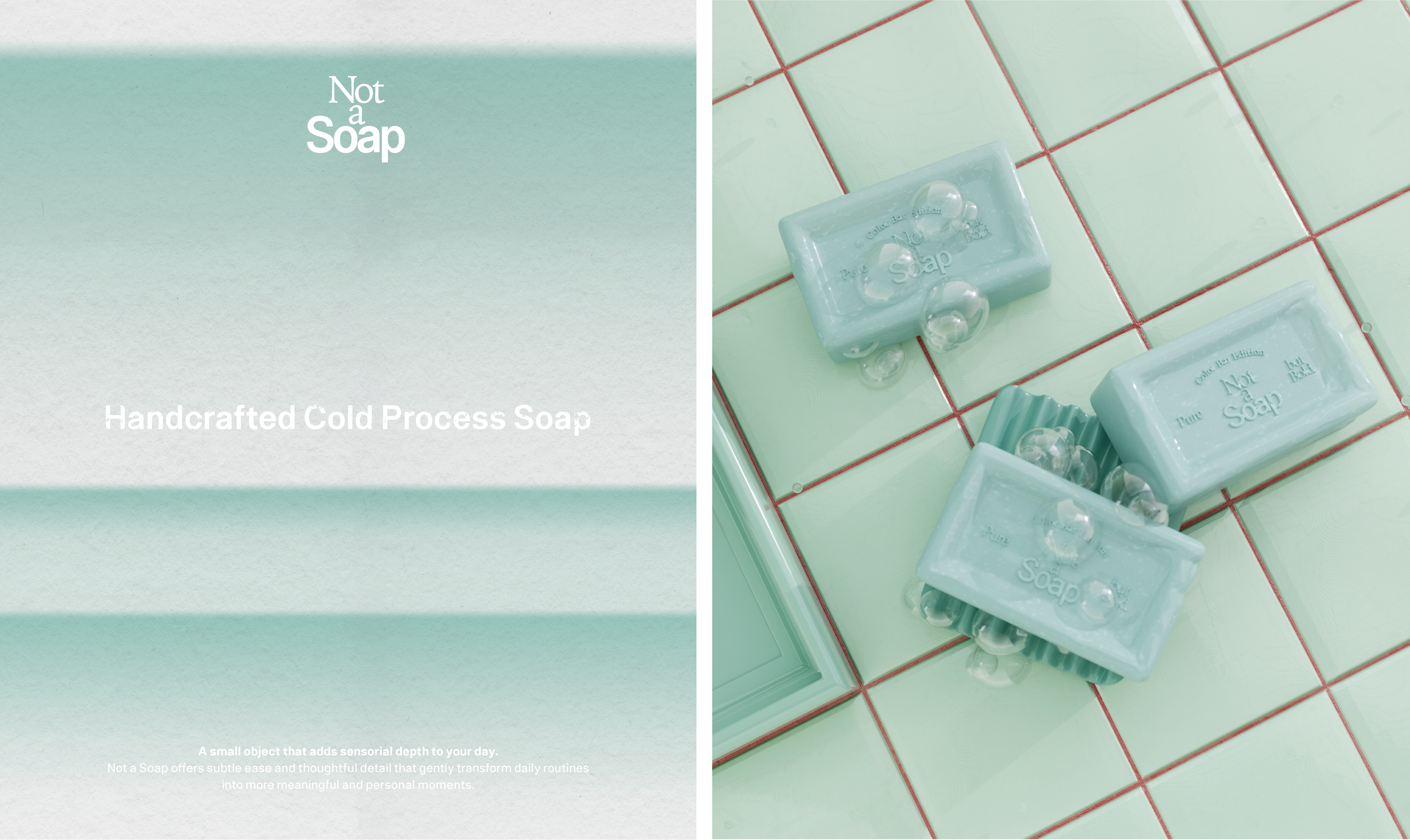
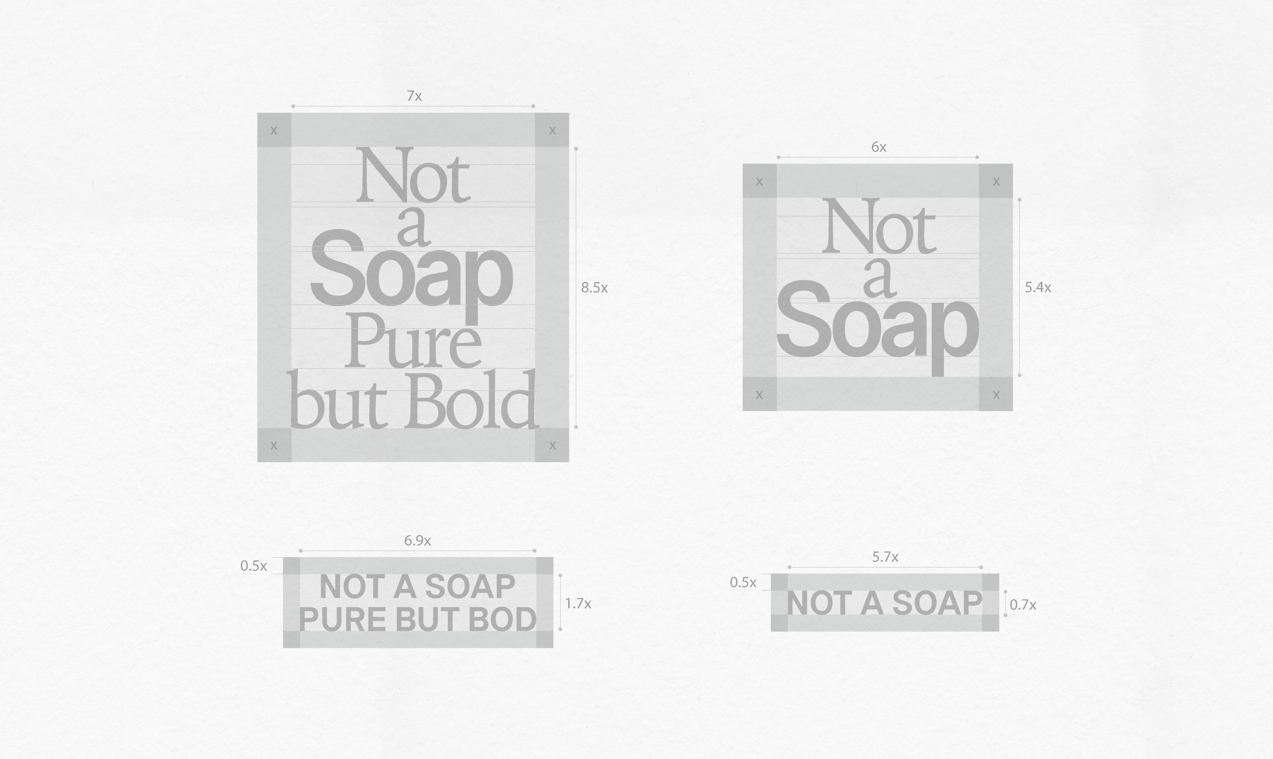
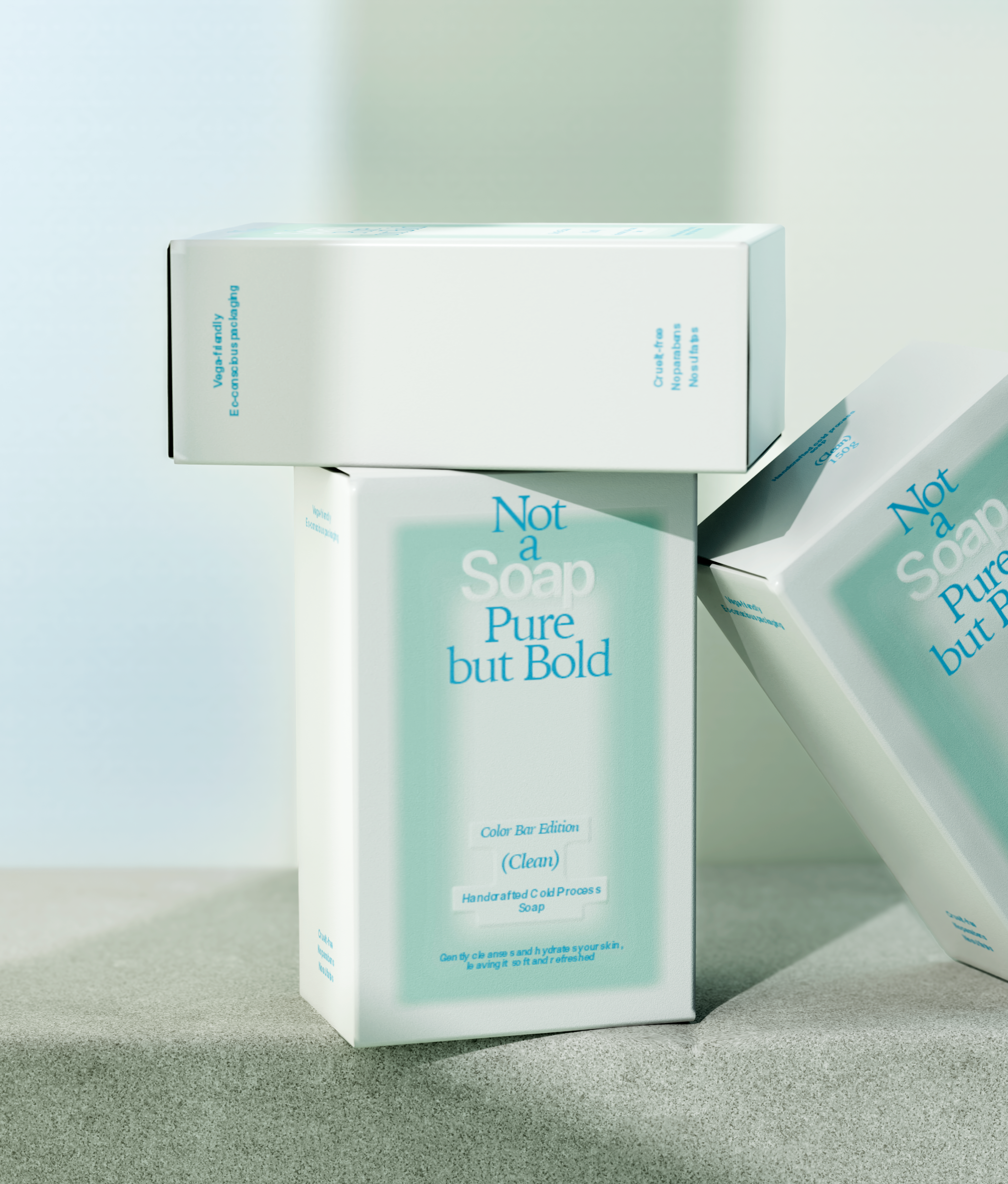
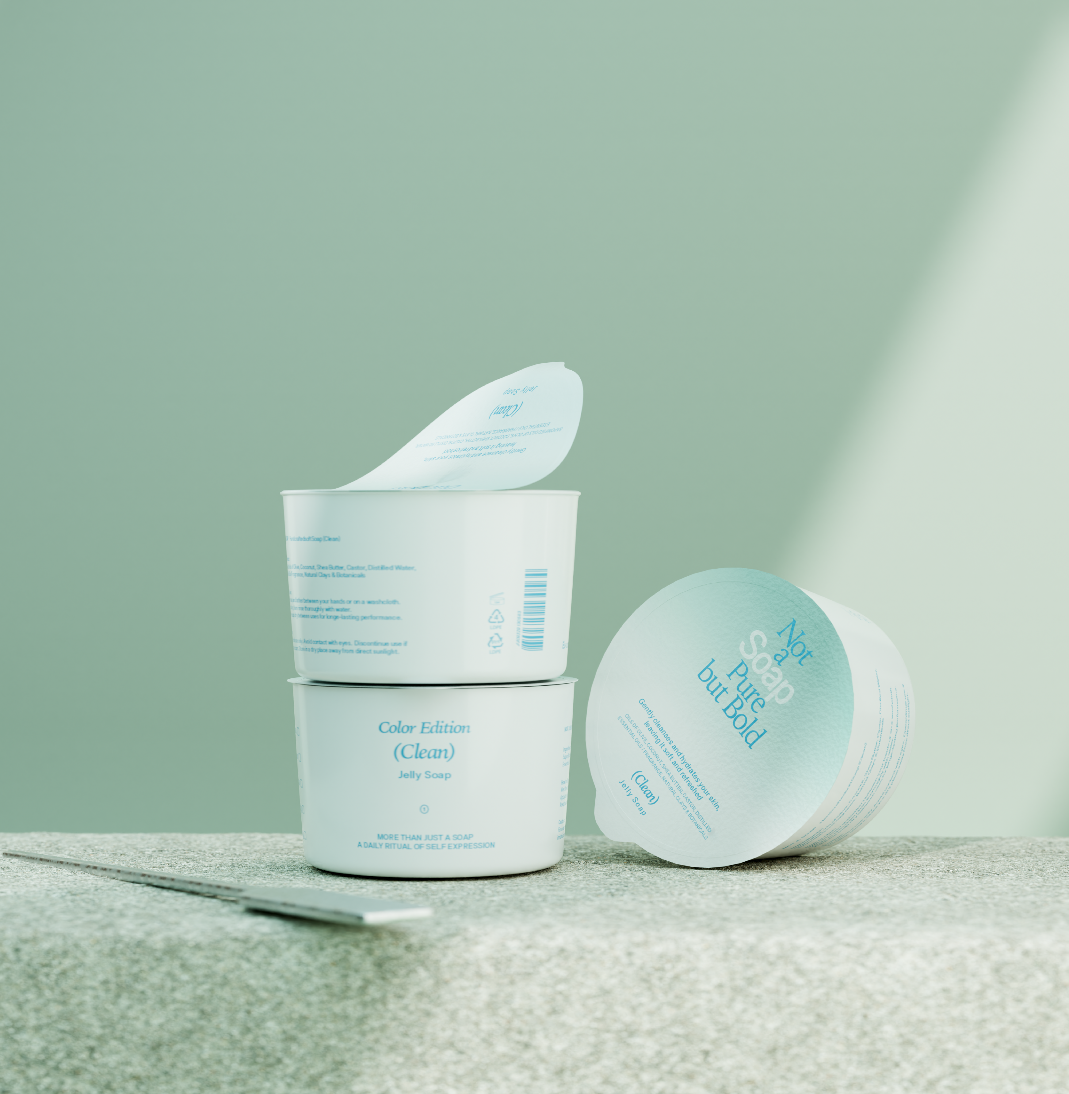
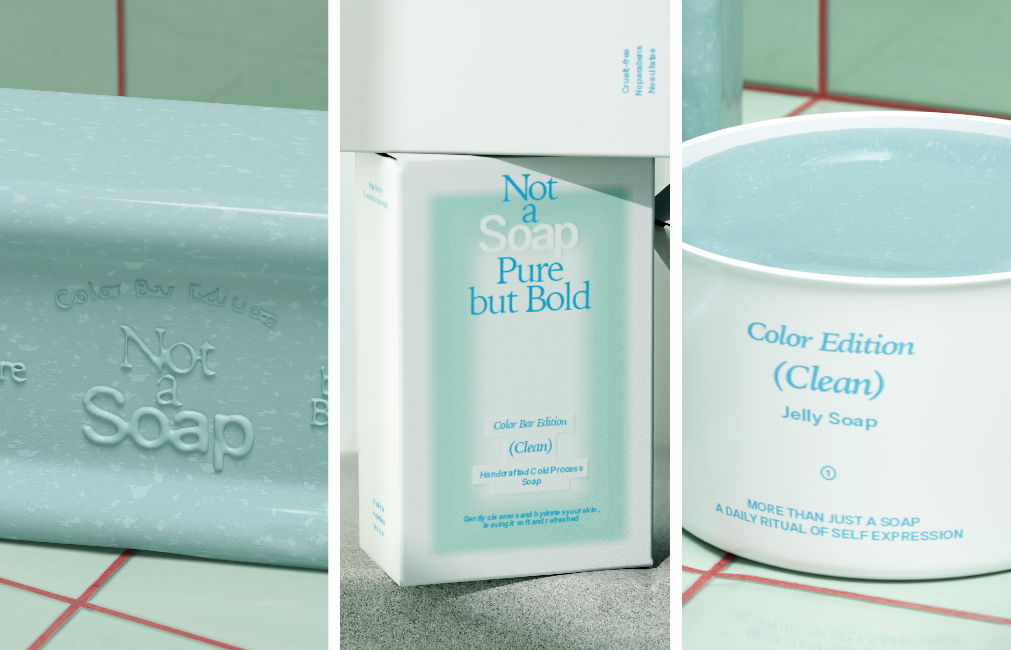
not a soap brand & packaging direction
design direction
전형적인 천연비누의 이미지를 벗어나, 세련된 감도로 재해석한 퍼스널 케어 브랜드입니다.
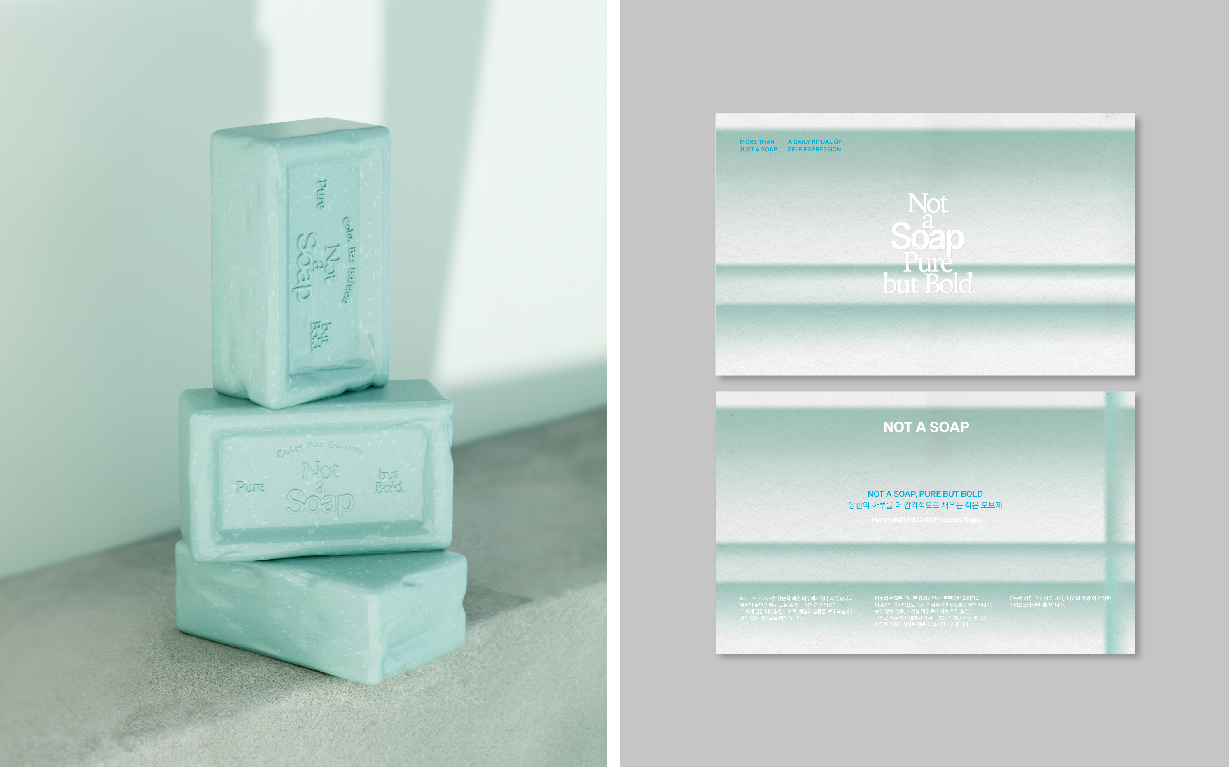
기능보다 감각을 우선한 형태, 절제된 타이포그래피, 오브제 같은 시각 구조를 통해 일상에 스며드는 ‘감각적 리추얼’로 자리잡습니다.
브랜드 기획 초기 단계부터 비주얼 아이덴티티, 패키지 디자인 전반을 총괄했으며 디자인을 통해 브랜드가 감각과 취향을 자극하는 존재로 자리잡고, 그 감각이 머무는 자리에 브랜드가 존재하길 바랐습니다.
A personal care brand that reinterprets the conventional image of natural soap with a refined sensibility. Prioritizing form over function, it embraces restrained typography and object-like visual structures to become a 'sensory ritual' woven into daily life.
From the initial brand planning stage, I led the visual identity and overall packaging design, aiming to position the brand as a presence that stimulates taste and emotion — one that quietly settles into the moments where our senses linger.

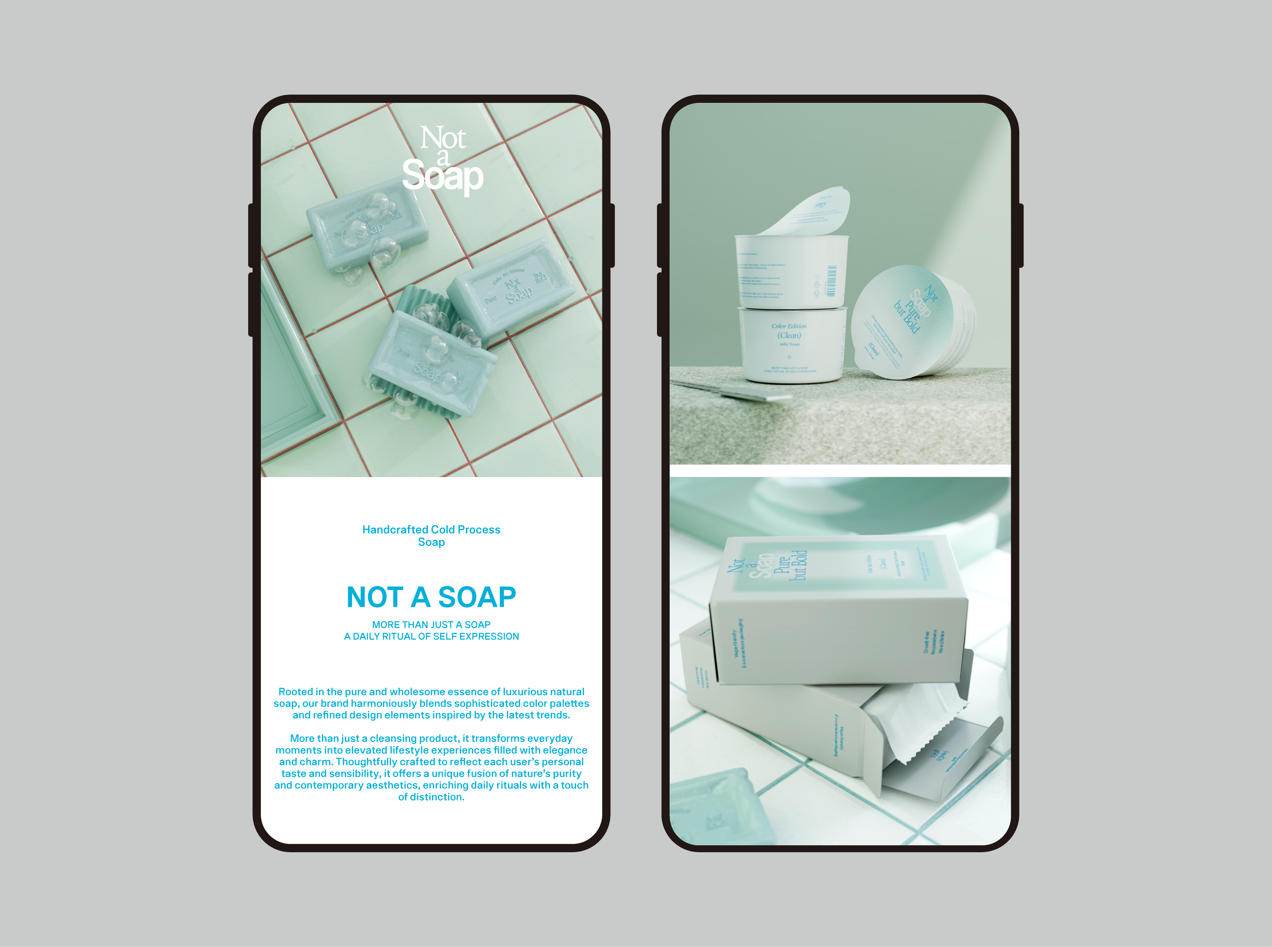
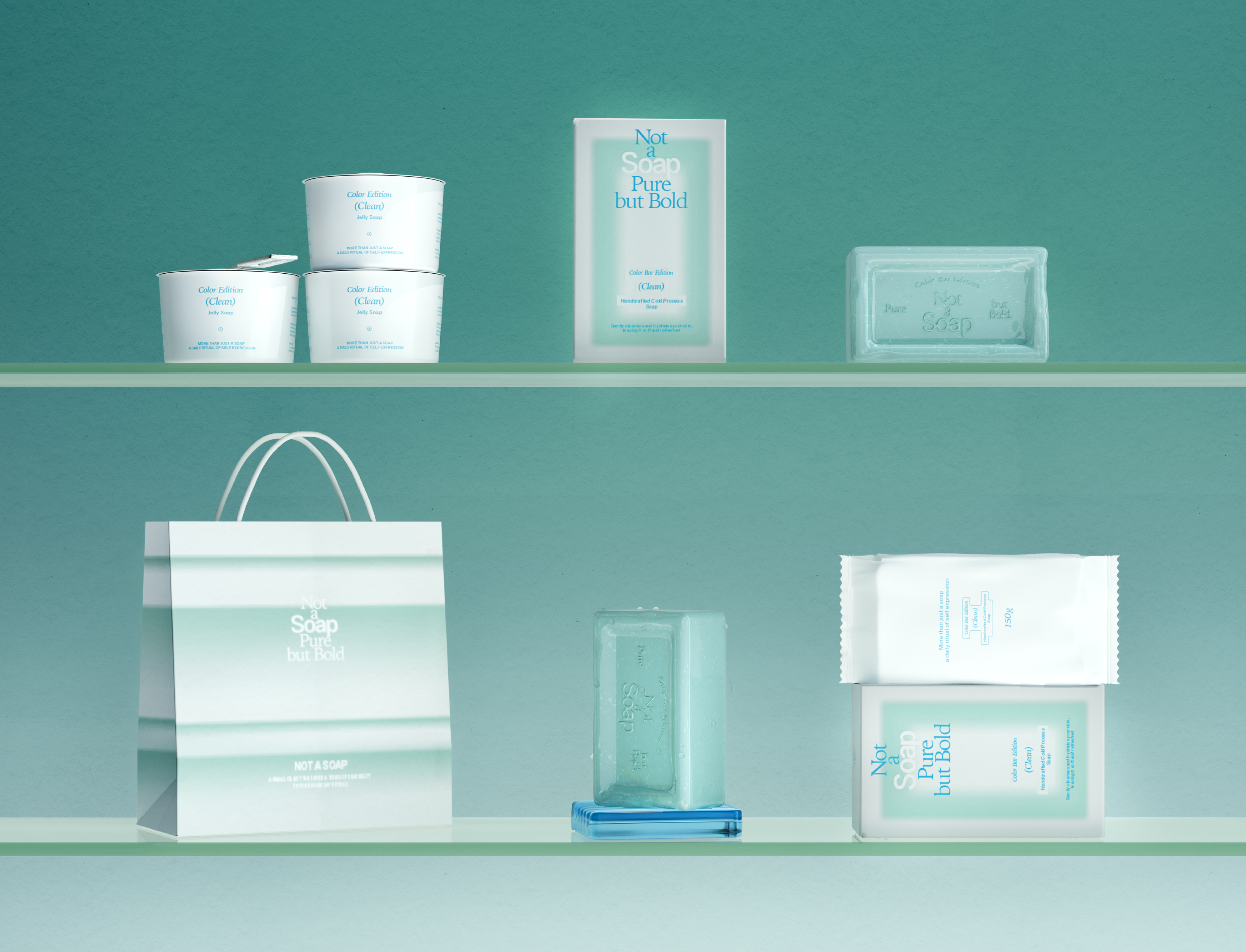
Not a Soap is more than soap. It's a ritual